White House Launches Climate Change Communication Tool that Treats Citizens Like Adults

ImaGeo iconImaGeo
By Tom Yulsman
Mar 19, 2014 8:53 PMNov 19, 2019 8:12 PM
BW-cottonwood-rohrshach2-1024x625.jpg

Newsletter

Sign up for our email newsletter for the latest science news
 

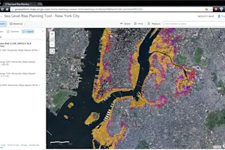
Screenshot of an interactive map accessible from data.gov/climate showing expected inundation of areas of New York City based on different projections of sea level. (Source: NOAA and data.gov/climate) A day after a major scientific organization released an embarrassingly ineffective report aimed at communicating the realities of climate change, the White House has launched something entirely different — and better. For now, it is a web portal that serves as a kind of clearinghouse for all manner of information on how sea level rise is remaking our coasts and posing risks to those who live and work along them. The screenshot above shows one of the interactive tools available on the site, data.gov/climate. In stunning graphic detail, it shows areas in the New York metro area that would become inundated in the future based on different projections of sea level rise. It's one of just dozens of such tools available right now on the site. And according to the White House, it is just the start of a major effort at climate change communication. The effort is designed to enable citizens to see how climate change is affecting them where they live and work, and what they might expect in the future, through interactive, graphics-based digital tools. Yesterday's report by the American Association for the Advancement of Science was, at its heart, a "We're scientists, so listen to what we say" effort. In contrast, the initiative launched by the White House today treats people like grownups and gives them powerful tools to learn for themselves what's happening. And unlike the AAAS report, its ultimate goal is to take full advantage of the power of digital technology — and visual communication — to empower people to plan for a future of climate change. I've only had time to scratch the surface of the new web site. But so far, I'm impressed. And I know that it will be helpful in my future reporting on climate change. To offer just one example, the web site offers access to an online, interactive tool from the National Oceanic and Atmospheric Administration that allows users to select a county and get a quick snapshot of its demographics, infrastructure and environment within flood zones. The results include a floodplain map, and graphics showing the overall population in floodplains, as well as the population over 65 years of age and in poverty that live in these areas, along with a plethora of other useful statistics and information. I'll be poking around the new site in coming days, and I may come back with an update on what I find.

1 free article left
Want More? Get unlimited access for as low as $1.99/month

Already a subscriber?

Register or Log In

1 free articleSubscribe
Discover Magazine Logo
Want more?

Keep reading for as low as $1.99!

Subscribe

Already a subscriber?

Register or Log In

More From Discover
Recommendations From Our Store
Shop Now
Stay Curious
Join
Our List

Sign up for our weekly science updates.

 
Subscribe
To The Magazine

Save up to 40% off the cover price when you subscribe to Discover magazine.

Copyright © 2024 Kalmbach Media Co.