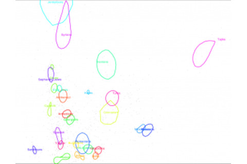
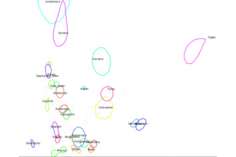
This is a follow up to my post from yesterday. In case you care about the technical details (after I clean this stuff up I will put it on GitHub) I'm using R's adehabitat package to create a 95% distribution curve after smoothing with kernel density. The goal is to give you a better intuition about where the populations are dispersed across two dimensional visualizations of genetic variation. Thinking about how to plot text, I came up with a quick hack, which just used the initial data and found the median x and y position. That explains why some of the labels are shifted so, in populations with a huge range the label position is going to be sensitive to not being smoothed (if you know how to pull out the centroid out of the kver, tell!). I've given them colors and also used black. The latter actually seems to be clearer! Note: This is not just for fun, as I plan to start rolling out results and methods from some of the data sets I have more regularly in the near future.
