Re-imagining genetic variation

By Razib Khan
Sep 26, 2012 7:39 AMOct 17, 2019 7:31 PM
genetic00
genetic00

Newsletter

Sign up for our email newsletter for the latest science news
 

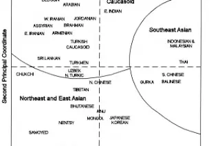
To the left is a PCA from The History and Geography of Human Genes. If you click it you will see a two dimensional plot with population labels. How were these plots generated? In short what these really are are visual representations of a matrix of genetic distances (those distances being general FST), which L. L. Cavalli-Sforza and colleagues computed from classical autosomal markers. Basically what the distances measure are the differences across populations in regards to their genetics. The unwieldy matrix tables can be visualized as a neighbor-joining tree, or a two dimensional plot as you see here. But that’s not the end of the story.

In the past ten years with high density SNP-chip arrays instead of just representing the relationship of populations, these plots often can now illustrate the position of an individual (the methods differ, from components analysis or coordinate analysis, to multi-dimensional scaling, but the outcomes are the same).

genetic01

 For example, the famous genetic map of Europe. Here you see the colors representing nationalities, and centroid positions of the populations as well as individuals. In this manner you can take into population genetic variation in a gestalt fashion. Nevertheless, these still leave something to be desired. They are precise and powerful, but they lack a certain elegance due to their scatter. When you have over a dozen color schemes, and overlapping populations, these are not minor matters. Additionally, the human eye is often not well tuned to note the finer gradients of density difference.

This is clear when you move from a manageable number of populations (e.g., Europeans), to the world. In these cases you have to color in specific regions, else you'd get lost rather quickly. I can illustrate this easy enough. I've a data set I'm running right now with ~3,000 individuals and 250,000 SNPs. It's a merge of HGDP, Behar et al., HapMap, etc. I decided to use PLINK to generate an MDS plot.

Here you see the unadorned scatter. To the top of the plot are Asian populations, and to the right African ones. Europeans are at the vertex to the bottom left. This should be familiar to you, though you may have to rotate it. One way to extract some clarity out of this picture is to color code the regions, and give different symbols to the lowest level category. Yes, this helps, but there are still limitations (and to be frank I often have a hard time making out triangles on these plots). First and foremost, I think we need to be unable to ascertain the variation in density of the scatter. A further plot will illustrate this (click to enlarge):

Most of the text is basically illegible. This is where a centroid method would do well; in lieu of a scatter of individuals you just label a population. Or, you could do something like allow points in various colors to represent populations, but put the labels at centroids only. This still runs into the problem that populations are not equidistant, so therefore you can have crowding.

Recently to address these issues I decided to use a 'utilization distribution' method which I saw in one of the 'genetic map of Europe' papers. The logic here is simple.

1) First, take the density distribution of the points on the plot by category and 'smooth' them. Basically this creates a continuous distribution where there was a discontinuous ones.

2) Then demarcate the central ~90% area as the bounds of the population distribution. Color these bounding lines differently.

Below you see the results:

Obviously there are some kinks to be worked out. But you see two things. First, some groups are clearly subsets of other groups in their distribution. This is very hard to discern in the other visualization methods above. Second, these plots are taking density into account, so you aren't distracted by outliers (which may be mislabeling by the analyst or the original collector of the samples).

My ultimate aim is to develop a script which will place the text near the suitable distribution zone, without crowding out other text. I have some ideas of how to do this "on the fly," but it will take time to implement. Until then some of you may want to know a bit about the packages used for the above.

First, download the adehabitat package from R. Actually, you may want to download various tcl development packages first, because the former won't install without the latter. Once you have that you need data. I assume you can generate the results from PLINK above. Once you have that you need to have three colums

1) x

2) y

3) the identification

Here’s some R that might help:

#MDSData is the data frame with MDS data attach(MDSData) library(adehabitat) cexValue=0 par(mar=c(0,0,0,0)) plot(C1,C2,cex=cexValue,xlab="Coordinate 1",ylab="Coordinate 2") # process the data, remove more than 5 individuals in group loc=subset(MDSData,Group %in% names(which(table(Group) >= 5))) loc$X = loc$C1 loc$Y = loc$C3 #load ids id = factor(loc$Group) #create first parameter, two columns loc=subset(loc,select=c(X,Y)) vud=kernelUD(loc,id) #90% utilization kVert=getverticeshr(vud, 9); #I'm removing one of the populations kVert[21]=NULL kVertLength=length(attr(kVert,"names")) plot(kVert, add=TRUE, lwd=2,colpol=NA,colborder=rainbow(kVertLength) ) groups=attr(kVert,"names") legend('topright',groups,cex=.55,lty=1,lwd=3,col=rainbow(kVertLength) )

1 free article left
Want More? Get unlimited access for as low as $1.99/month

Already a subscriber?

Register or Log In

1 free articleSubscribe
Discover Magazine Logo
Want more?

Keep reading for as low as $1.99!

Subscribe

Already a subscriber?

Register or Log In

More From Discover
Recommendations From Our Store
Shop Now
Stay Curious
Join
Our List

Sign up for our weekly science updates.

 
Subscribe
To The Magazine

Save up to 40% off the cover price when you subscribe to Discover magazine.

Copyright © 2024 Kalmbach Media Co.