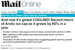
A screenshot of the top of a global warming story in The Mail yesterday. The headline and bullet points above accompanied a story over the weekend by David Rose in the U.K. newspaper the Mail. It now seems to be gaining traction elsewhere in the media, including in a story in the Telegraph (which seems to be largely copied from the Mail), and this item on MSN Now. Let us count the ways that the headline and story violate the principles of journalism I will be discussing with 130 eager young undergraduates this afternoon in a class I teach at the University of Colorado. Literally. That's the purpose of this piece. Rose writes the following at the top of his story:
A chilly Arctic summer has left nearly a million more square miles of ocean covered with ice than at the same time last year – an increase of 60 per cent. The rebound from 2012’s record low comes six years after the BBC reported that global warming would leave the Arctic ice-free in summer by 2013. Instead, days before the annual autumn re-freeze is due to begin, an unbroken ice sheet more than half the size of Europe already stretches from the Canadian islands to Russia’s northern shores.
Rose uses the recovery in Arctic sea ice since last year's record low extent as evidence to bolster the main points of his piece: that global warming has stopped, and that we appear to be entering into a long-term cooling trend. Let's put aside Rose's apparent ignorance of the difference between Arctic sea ice and an "ice sheet" (the latter, according to the National Snow and Ice Data Center, being glacial land ice extending more than 20,000 square miles). He is correct that the geographic extent of this year's Arctic sea ice is greater than last year's. But he cherry picks information to support his claim rather than provide readers with a full picture. Here's what the National Snow and Ice Data Center reported five days ago about Arctic sea ice extent for August 2013 — namely that it is:
...1.03 million square kilometers (398,000 square miles) below the 1981 to 2010 average for August, but well above the level recorded last year, which was the lowest September extent in the satellite record. Ice extent this August was similar to the years 2008 to 2010. These contrasts in ice extent from one year to the next highlight the year-to-year variability attending the overall, long-term decline in sea ice extent.
Rose completely ignores that latter point about year-to-year variability. The thumbnail at right is a graphic from the NSIDC showing both the variability and the long-term trend. Click on it for a larger version. Of course we can't say for sure whether next August will bring more or less sea ice than it did this year. But in his story, Rose implies that one year kills a 35-year trend. That's not journalism. It's activism. If the past is any guide to what may happen in the future, this animated gif, from the website Skeptical Science, may provide some insight:
The portions marked in red show when Arctic sea ice extent at the end of September was greater than the previous year. As the caption accompanying the graphic puts it:
Many factors affect the annual summer decrease in Arctic sea ice extent, and it is illogical at best to claim any "trend" by cherry-picking only brief periods of data. The obvious true long-term trend in Arctic sea ice extent (red second-order polynomial curve fit) is that it is declining at an accelerating rate.
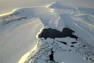
Another way to contextualize what has happened this summer is to compare it to recent years. Click on the thumbnail at left for a graph that does just that. It shows August sea ice extent for the past six years. Seen in this context, 2013 obviously doesn't look anything like last year's astonishingly low extent. But it is very much like recent years — all of which were below the long-term average. While relatively cool temperatures prevailed this summer over the central Arctic, the National Snow and Ice Data Center is reporting that a "large hole" has opened in the ice near the North Pole. According to NSIDC, "Small areas of open water are common within the ice pack, even at the North Pole, as the ice pack shifts in response to winds and currents, resulting in cracks (called leads) in the ice. The current opening seen in our satellite imagery is much larger." The animated gif below offers two views of this apparent stretch of open water:
An animated gif mapping Arctic sea ice concentration in the first frame, and a mosaic of satellite images of the same area in the second, both from Sept. 2, 2013. (Sea ice concentration: NSIDC; Arctic mosaic: NASA; Animated gif: Tom Yulsman) The colored map shows the concentration of Arctic sea ice, as measured by the the AMSR2 satellite instrument. The second frame in the animation is a mosaic of images from NASA's Aqua satellite. Both are centered on the North Pole. Look above and to the right of the North Pole for the apparent area of open water. I won't commit the same journalistic sin as David Rose of the Mail by implying that this says something significant about what will come next in the Arctic, or that it is some sort of symptom of global warming. But I also won't hide it from you in the interest of activism, as Rose did.
Source: Polar Science Center
Rose also failed to mention another important factor: the volume of Arctic sea ice. Up until now, we've been looking at the geographic extent of the ice cover — how many square miles of ocean is covered by floating ice. If you want the full picture of what's happening to Arctic sea ice, you have to consider volume as well. Click on the thumbnail at right for a graph showing how it has evolved over time.
Once again, the trend is far from a straight line. There are ups and downs related to year-to-year variations in conditions. But the trend is pretty clear.
That said, please consider an important caveat from the scientists who created the graph:
Sea ice volume is an important climate indicator. It depends on both ice thickness and extent and therefore more directly tied to climate forcing than extent alone. However, Arctic sea ice volume cannot currently be observed continuously. Observations from satellites, Navy submarines, moorings, and field measurements are all limited in space and time.
In other words, observations alone are insufficient to get a full picture of sea ice volume. So the researchers use a computer called "PIOMAS" to estimate it. In its numerical simulations, the model uses a variety of actual observations as inputs. And it is "validated through comparisons with observations from U.S. Navy submarines, oceanographic moorings, and satellites."
For all of the details and caveats, go here
and see "Model Validation and Uncertainty."
By now, I've no doubt lost most readers with all of this detail. Which of course highlights the difficulty of trying to do a journalistically responsible job on a story like this. To provide proper context, and to highlight the uncertainties along with the findings, requires quite a bit of explanation, not all of it terribly compelling. By comparison, waving one's arms in the air is far easier. I'll conclude by tackling Rose's main point: that the Earth is cooling. He makes all sorts of claims, including that the Intergovernmental Panel on Climate Change is convening an "emergency" meeting to discuss it in advance of the release of the next IPCC report. And he quotes two scientists in order to bolster his claim that the globe is cooling, or at least that there is greater uncertainty now than there was in previous years.
Much can be — and has been — written on the global cooling meme. My friend and colleague Andrew Revkin wrote about it here, and I urge you take a look at his balanced and nuanced view. In his piece he quotes a number of scientists, including Ben Santer at the Lawrence Livermore Laboratory. Here's part of what Santer said:
The bottom line is that the identification of human effects on climate is a signal-to-noise problem. A human-caused warming signal is embedded in the rich, year-to-year and decade-to-decade noise of natural internal climate variability. Scientifically, we never had the expectation that there would be some monotonic warming signal in response to slow, human-caused changes in greenhouse gases, with each year inexorably warmer than the previous year.
To conclude, here is a way to visualize Santer's point:
Source: Skeptical Science This is another useful animated gif from Skeptical Science
. It shows in green how the global land surface temperature has departed from the long term average. Linear trends have been applied to the timeframes 1973 to 1980, 1980 to 1988, 1988 to 1995, 1995 to 2001, 1998 to 2005, 2002 to 2010, in blue. As well as 1973 to 2010 (red). The point is that warming can stall, and temperatures can even cool, over a period of years — even as the long-term trend is one of warming. Time will tell whether we've entered something different. But we don't know yet, despite what David Rose said in his irresponsible story.