Population structure, concrete and ineffable

Gene Expression
By Razib Khan
Aug 5, 2013 7:58 AMOct 17, 2019 3:41 PM
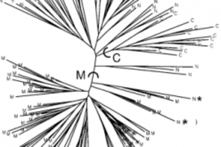
NJtree
Pritchard, Jonathan K., Matthew Stephens, and Peter Donnelly. "Inference of population structure using multilocus genotype data." Genetics 155.2 (2000): 945-959.

Newsletter

Sign up for our email newsletter for the latest science news
 

Before there was Structure there was just structure. By this, I mean that population substructure has always been. The question is how we as humans shall characterize and visualize it in a manner which imparts some measure of wisdom and enlightenment. A simple fashion in which we can assess population substructure is to visualize the genetic distances across individuals or populations on a two dimensional plot. Another way which is quite popular is to represent the distance on a neighbor joining tree, as on the left. As you can see this is not always satisfying: dense trees with too many tips are often almost impossible to interpret beyond the most trivial inferences (though there is an aesthetic beauty in their feathery topology!). And where graphical representations such as neighbor-joining trees and MDS plots remove too much relevant information, cluttered Fst matrices have the opposite problem. All the distance data is there in its glorious specific detail, but there's very little Gestalt comprehension.

Rosenberg, Noah A., et al. "Genetic structure of human populations." Science 298.5602 (2002): 2381-2385.

Into this confusing world stepped the Structure bar plot. When I say "Structure bar plot," in 2013 I really mean the host of model-based clustering phylogenetic packages. Because it is faster I prefer Admixture. But Admixture is really just a twist on the basic rules of the game which Structure set. What you see to the right is one of the beautiful bar plots which have made their appearance regularly on this blog over the past half a decade or more. I've repeated what they do, and don't mean, ad nauseum, though it doesn't hurt to repeat oneself. What you see is how individuals from a range of human populations shake out at K = 6. More verbosely, assume that your pool of individuals can be thought of as an admixture to various proportions of six ancestral populations. Each line is an individual, and the proportional shading of each line and the specific color represents a particular K (for K = 6, population 1, 2, 3, 4, 5, 6).

This is when I should remind you that this does not mean that these individuals are actually combinations of six ancestral populations. When you think about it, that is common sense. Just because someone generates a bar plot with a given K, that does not mean that that bar plot makes any sense. I could set K = 666, for example. The results would be totally without value (evil even!), but, they would be results, because if you put garbage in, the algorithm will produce something (garbage). This is why I say that population structure is concrete and ineffable. We know that it is the outcome of real history which we can grasp intuitively. But how we generate a map of that structure for our visual delectation and quantitative precision is far more dicey and slippery.

To truly understand what's going on it might be useful to review the original paper which presented Structure, Inference of Population Structure Using Multilocus Genotype Data. Though there are follow-ups, the guts of the package are laid out in this initial publication. Basically you have some data, multilocus genotypes. Since Structure debuted in 2000, this was before the era of hundreds-of-thousands-loci-SNP-chip data. Today the term multilocus sounds almost quaint. In 2000 the classical autosomal era was fading out, but people did still use RFLPs and what not. It is a testament to the robustness of the framework of Structure that it transitioned smoothly to the era of massive data sets. Roughly, the three major ingredients of Structure are the empirical genotype data, formal assumptions about population dynamics, and, powerful computational techniques to map between the two first two elements. In the language of the paper you have X, the genotypes of the individuals, Z, the populations, and P, the allele frequencies of the populations. They're multi-dimensional vectors. That's not as important here as the fact that you only have X. The real grunt work of Structure is generating a vector, Qwhich defines the contributions to each individual from the set of ancestral populations. This is done via an MCMC, which explores the space of probabilities, given the data, and the priors which are baked into the cake of the package. Though some people seem to treat the details of the MCMC as a black-box, actually having some intuition about how it works is often useful when you want to shift from default settings (there are indeed people who run Structure who are not clear about what the burn-in is exactly). What's going on ultimately is that in structured populations the genotypes are not in Hardy-Weinberg EquilibriumStructure is attempting to find a solution which will result in populations in HWE.

This brings us to the question of how we make sense of the results and which K to select. If you run Structure you are probably iterating over many K values, and repeating the iteration multiple times. You will likely have to merge the outputs for replicates because they are going to vary using a different algorithm. But in any case, each iteration generates a likelihood (which derives from the probability of the data given the K value). The most intuitive way to "pick" an appropriate K is to simply wait until the likelihood begins to plateau. This means that the algorithm can't squeeze more informative juice going up the K values.* This may seem dry and tedious, but it brings home exactly why you should not view any given K as natural or real in a deep sense. The selection of a K has less to do with reality, and more with instrumentality. If, for example your aim is to detect African ancestry in a worldwide population pool, then a low K will suffice, even if a higher K gives a better model fit (higher K values often take longer in the MCMC). In contrast if you want to discern much finer population clusters then it is prudent to go up to the most informative K, no matter how long that might take.

Today model-based clustering like Structure, frappe, and Admixture are part of the background furniture of the population genetic toolkit. There are now newer methods on the block. A package like TreeMix uses allele frequencies to transform the stale phylogram into a more informative set of graphs. Other frameworks do not rely on independent information locus after locus, but assimilate patterns across loci, generating ancestry tracts within individual genomes. Though some historical information can be inferred from Structure, it is often an ad hoc process which resembles reading tea leaves. Linkage disequilibrium methods have the advantage in that they explicitly explore historical processes in the genome. But with all that said, the Structure bar plot revolution of the aughts wrought a massive change, and what was once wondrous has become banal.

* The ad hoc Delta K statistic is very popular too. It combines the rate of change of the likelihoods and the variation across replicate runs.

0 free articles left
Want More? Get unlimited access for as low as $1.99/month

Already a subscriber?

Register or Log In

0 free articlesSubscribe
Discover Magazine Logo
Want more?

Keep reading for as low as $1.99!

Subscribe

Already a subscriber?

Register or Log In

More From Discover
Recommendations From Our Store
Shop Now
Stay Curious
Join
Our List

Sign up for our weekly science updates.

 
Subscribe
To The Magazine

Save up to 40% off the cover price when you subscribe to Discover magazine.

Copyright © 2024 Kalmbach Media Co.