

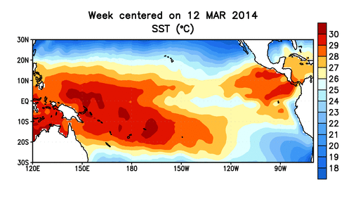
In this animation of sea surface temperatures in the tropical Pacific Ocean between March and June, watch for a gradual warming in much of the region. (Source: NOAA Climate Prediction Center) In a previous post, I wrote that "El Niño's comin' (probably)." Now, it's probably not too much of a stretch to replace "probably" with "almost but not quite definitely." Some of the key aspects of an El Niño, which typically brings drought to some places, deluges to others, and a warmer globe overall, are now firmly in place. This prompted the U.S. Climate Prediction Center yesterday to up the odds of an El Niño occurring during summer in the Northern Hemisphere to 70 percent, and to 80 percent by fall and winter. Fixated as I was yesterday on convective mayhem in the Central U.S., I didn't have time to write about this right when the report came out. So ...
Things Look El Niño-ish. But Things Could Change...
El Niño conditions are developing with high odds; impacts on Australia rainfall and global climate are imminent. Learn more!
More on Discover


Stay Curious
SubscribeTo The Magazine
Save up to 40% off the cover price when you subscribe to Discover magazine.
Subscribe