My pick for the most compelling — and scary — remote sensing image of 2018

ImaGeo iconImaGeo
By Tom Yulsman
Dec 30, 2018 5:23 AMNov 19, 2019 8:47 PM
Camp_Fire_L8.jpg

Newsletter

Sign up for our email newsletter for the latest science news
 

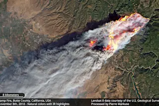
An image of California's Camp Fire, created using natural color and infra-red data acquired by the Landsat-8 satellite on Nov. 8, 2018. (Image courtesy Pierre Markuse) This past year brought all too many disasters, including rampaging wildfires, destructive volcanic eruptions, swirling tropical cyclones, and a host of other events that brought misery to millions of people worldwide. Many were visualized by satellites looking down on Earth, and as 2018 draws to a close, I thought I'd feature one that I found to be particularly compelling. It's the image above showing California's Camp Fire, created by blogger and remote sensing expert Pierre Markuse. It's my personal pick for top remote sensing image of 2018. The Camp Fire ignited on Nov. 8, 2018 and quickly exploded, engulfing and ultimately destroying the town of Paradise, California. As of Dec. 19, the death toll stood at 86 people, which makes it the seventh deadliest wildfire in U.S. history, and the 14th deadliest worldwide. (Jeff Masters of the Category 6 blog tallied the statistics here. But keep in mind that since he wrote his story, the death toll of the Camp Fire was actually reduced.) Ultimately engulfing 153,336 acres — about half the size of the City of Los Angeles — the Camp Fire was also the most destructive wildfire in California history, incinerating 14,500 residential and commercial buildings. Markuse created the image using data from the Landsat-8 satellite. I find it particularly noteworthy for a number of reasons. First, you can see the town of Chico, population 93,293, toward the left, partly obscured by the huge smoke plume. This provides a sense of scale. Also, Markuse combined natural color with data acquired in the infrared portion of the electromagnetic spectrum to produce the image. The infrared data helps us see the heat from the flames, which otherwise would be difficult if not impossible to see through the smoke. This combination yields an image of incredible power. And the power does not just come from the overall impression. Click on Pierre's image and then click on it again to enlarge it. At this point, Paradise is pretty much completely engulfed in the flames. And in what I'm pretty sure is the heart of the town, I see a regular pattern of rectangular orange hotspots — perhaps (and I would even say probably) indicative of entire blocks of the city on fire. Without the addition of the infrared data, this would not have been visible. NASA's Earth Observatory published an image very much like this one, using the same Landsat-8 data. But I find Pierre's even more compelling. And besides, he's a fellow independent blogger, so his image is my top pick. I should add that Pierre has just published an incredibly useful satellite image guide for journalists. But I think anyone with an interest in remote sensing could get something out of it. The guide is an incredible resource — and this is another reason that I wanted to feature Markuse's image as my top pick for 2018. We're talking about an individual blogger here, not NASA with all of its resources. More power to citizen journalists!

1 free article left
Want More? Get unlimited access for as low as $1.99/month

Already a subscriber?

Register or Log In

1 free articleSubscribe
Discover Magazine Logo
Want more?

Keep reading for as low as $1.99!

Subscribe

Already a subscriber?

Register or Log In

More From Discover
Recommendations From Our Store
Shop Now
Stay Curious
Join
Our List

Sign up for our weekly science updates.

 
Subscribe
To The Magazine

Save up to 40% off the cover price when you subscribe to Discover magazine.

Copyright © 2024 Kalmbach Media Co.