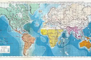
from The Geographical Distribution of Animals (1876), by Alfred Russel Wallace
Modern biogeography---the study of the distribution of species---still relies heavily on the above map, despite the fact that it was drawn by the field's founder, Alfred Russel Wallace, in 1876. The map indicates regions of historical species mixing, pointing out, for instance, that a mouse in North Africa is more likely and able to mix with its European brethren than its South African cousins. This week researchers have revealed a new and improved biogeographical map, published in Science, which they hope will become the new baseline for ecological and evolutionary studies as well as conservation efforts.
Wallace's map, and accompanying two-volume text, was an early attempt to divide and define the world according to its species. He was a scientific maverick in his day. The traveling naturalist co-discovered the theory of natural selection alongside (but independently from) Darwin, and even has an evolutionary hypothesis---the Wallace effect---named after him. Despite major challenges (evolution was still a highly contested theory and a universal classification system for species had not yet been established), Wallace divided the world into distinct zoobiological regions back in the 1870s. These regions were bounded by barriers to species mixing, including high mountains, deep oceans and regional vegetation, as well as historical factors such as the presence of land bridges and glaciation.
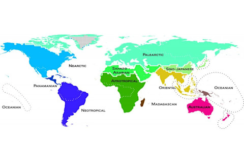
from An Update of Wallace's Zoogeographic Regions of the World (2012), by Ben G. Holt, et al. Evolutionary biology has come a long way in the nearly a century and a half since the publication of Wallace's seminal work, so researchers now have a much more robust dataset to work with. The new map is not the first attempt to revamp Wallace's work but it is the first to employ data on the distribution of species as well as the evolutionary relationships between them. The researchers spent 20 years compiling data from over 20,000 species of amphibians, birds and mammals. The result is an atlas divided into 11 new biogeographic realms. The color differences between the realms indicate the number of branches on its species' evolutionary trees. The new map offers scientists a holistic view of how animal species have changed over time and space. As an added bonus, the map can also be scaled to zoom in on specific geographic areas or animal groups. This may help evolutionary biologists define the still-elusive forces that shape species' evolution. It may also help conservation managers re-prioritize their efforts based on species' evolutionary histories and geographic distributions rather than uniqueness alone. As species continue to migrate and mix in new ways in our changing global environment, let's hope we don't have to wait another 136 years for the map's next update.


