

This article was originally published on Nov. 3, 2016.
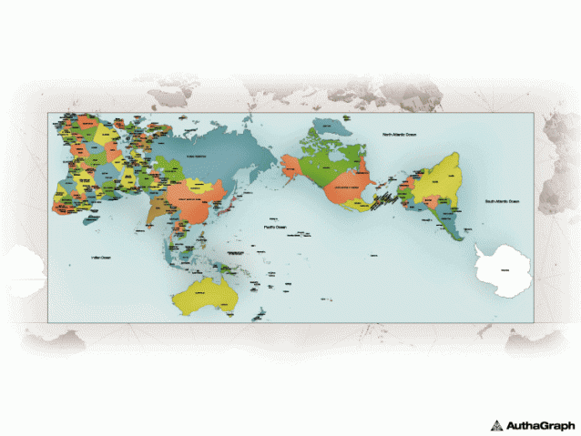
Our maps have been lying to us for centuries.
The standard classroom maps we all learned geography from are based on the Mercator projection, a 16th century rendering that preserved lines used for navigation while hideously distorting the true sizes of continents and oceans further from the equator. The result is a widespread misconception that Greenland is as big as Africa, Siberia and Canada are disproportionately massive, and that Antarctica apparently just goes on forever.
Mercator Projection (Credit: Daniel R. Strebe/Wikimedia Commons)
Daniel R. Strebe/Wikimedia Commons
In reality though, Africa is larger than all of North America, and the Antarctic is about as big as Australia. That’s the difficulty with stretching a sphere to fit a rectangle, and for centuries cartographers have struggled to balance maintaining straight latitudinal lines with the preservation of perspective. But the AuthaGraph may be the pinnacle ...


