

skip to main content

Obesity → happiness?

Discover intriguing insights on self-reported happiness across different weight classes in engaging charts. Click to learn more!

Written byRazib Khan
| 1 min read
Follow on GoogleGoogle News Preferred Source
Placeholder image

Newsletter

Sign up for our email newsletter for the latest science news

Sign Up

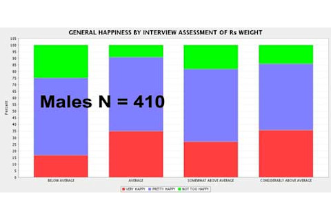
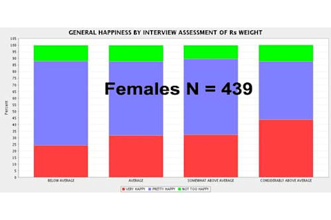
Sometimes social data are weird & unexpected. Below the fold are two charts which compare the self-reported happiness of people of various weight classes. From left to right: below average, average, above average and considerably above average. Red = very happy, blue = happy and green = not too happy.
Placeholder image showing Earth from space with an alert icon and the message ‘This image is no longer available.’

Placeholder image showing Earth from space with an alert icon and the message ‘This image is no longer available.’

The Inductivist has the full post.

Meet the Author

Stay Curious

JoinOur List

Sign up for our weekly science updates

View our Privacy Policy

SubscribeTo The Magazine

Save up to 40% off the cover price when you subscribe to Discover magazine.

Subscribe